Timeline
November - December 2023 (3 weeks)
Role
Solo Student Project
Deciding the conceptHow does one illustrate “Ao no Sumika”conceptually?
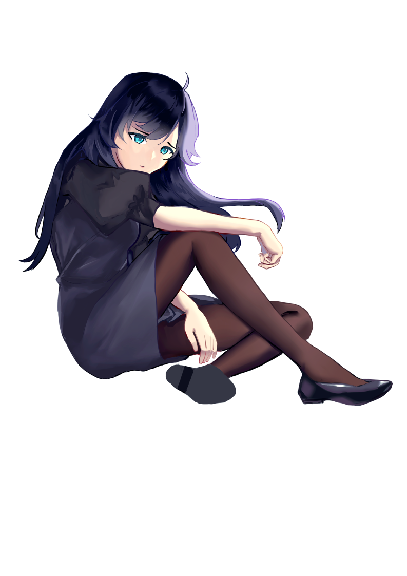
Sakuya embodies conflicting desires between family duty and personal happiness due to her wealthy background and outside societal pressure. Her body language reflects her anxieties, and her dark design echoes the meaning of her name.
In contrast, Umeko represents positivity, offering a vibrant and cheerful presence in Sakuya's life. Umeko's free-spirited nature contrasts Sakuya's constrained upbringing as her vibrant and cheerful personality helps bring joy. Her flashy body language and color palette reflect the meaning of her name. Therefore, both characters' designs stand as opposites, highlighting their distinct personalities.

illustrating the Booklet coverIn what ways does the environment contribute to the narrative and enrich the story?
"Blossoms in the Garden" is a story set primarily in Tokyo, Japan.
"Summer in Hakone" captures a vacation trip to the nearby Kanagawa prefecture with the summer weather, featuring Hakone Shrine's lakefront torii.
"A Symphony of Cherry Blossoms" symbolizes the blossoming of Sakuya and Umeko's feelings for each other during the spring season.
Together, these vibrant illustrations idealize the characters' world, bringing a sense of happiness, warmth, and beauty. It creates a contrast with the challenges and conflicts the characters face, emphasizing the emotional impact of their relationship and making their moments of togetherness feel more special and rewarding.

the Booklet's backing illustrationConveying the passage of time
This illustration captures a fleeting moment between Umeko and Sakuya on a Tokyo train early in the morning. The scene stretches across ten panels, spanning three pages to linger on this point in time. The setting remains confined to the interior of the train cart, with the fourth panel of the first page breaking out to display the train's motion as the scene plays out.

illustrating behind the CD discHow does the cover illustration encapsulate the story's mood and themes?
The cover of "Blossoms in the Garden" features symbolic elements tied to the names of Sakuya and Umeko. The plural "Blossoms" reflects the connection between each other. Yet, a gate separates them, symbolizing Sakuya's inner turmoil and conflict, while Umeko is depicted in the garden, representing her self-acceptance.
The rain sets the solemn mood and environmental ambiance for the story. While on the back cover, two umbrellas lean against each other, signifying the characters' growing closeness throughout the book. This same pair of umbrellas on the cover suggests that Sakuya and Umeko have bridged the gap and that the rain of their struggles has come to an end.
designing the back of the cd caseHow does the final illustration complement the ending of the story?
In the opening of "Blossoms in the Garden," Sakuya and Umeko were depicted apart, standing in the rain, symbolizing their emotional distance. However, the final illustration presents a striking contrast, showing the two characters together in the garden, holding hands, basking in the warm sunlight. This scene serves as the symbolic opposite of the cover image, representing the couple's eventual "happy ending" after overcoming numerous hardships to be together.

building the CD discHow does the cover illustration encapsulate the story's mood and themes?
The cover of "Blossoms in the Garden" features symbolic elements tied to the names of Sakuya and Umeko. The plural "Blossoms" reflects the connection between each other. Yet, a gate separates them, symbolizing Sakuya's inner turmoil and conflict, while Umeko is depicted in the garden, representing her self-acceptance.
The rain sets the solemn mood and environmental ambiance for the story. While on the back cover, two umbrellas lean against each other, signifying the characters' growing closeness throughout the book. This same pair of umbrellas on the cover suggests that Sakuya and Umeko have bridged the gap and that the rain of their struggles has come to an end.


book cover with mockupThe Final Product


inside the bookletWhat I’d do differently
In my storyboard project, I explored various color and lighting options. Given that the project was done in full color, I believe experimenting with black and white illustrations and half-tone textures would have been better, capturing the style commonly seen in Japanese manga. Restricting my color palette could have led to a stronger focus on values, composition, and the skill of applying digital half-tones, refining my artistic skills. Looking back, I feel that spending less time on color consistency and more on panel flow would have been a valuable approach.
Upon reviewing my book cover illustration, I realized that a single, cohesive full-spread illustration would have been better than having two separate elements for the front and back. This approach would have created a more seamless and harmonious visual experience for the readers since there is a slight disconnect between the illustrated front and mostly solid back cover.
My male character was rejected by my mentor for this project, but I hope to improve his character in order to implement him in my project.